Nuclear. Nuqta: A conversation with Muiz
Author ········· Danah Abdulla
Published ······ Online, Oct 2012
Section ······· Art & Design
Published ······ Online, Oct 2012
Section ······· Art & Design

I was excited to attend Nuclear Nuqta, an exhibit of visual communicator Muiz’s work, because there aren’t many exhibits by Arab designers. I was invited to the exhibit via email by a woman named Julie and realised that when I walked into the Leighton House Museum in London on the night of the opening, I had no image of what the artist looks like (except for the back of his head, which is the image he uses on his Twitter account), nor of the person who invited me to the exhibit. As I walk around observing the work, a young man approaches me and asks me if I’m leaving. I inform him that I’m looking for Julie in order to interview Muiz about the work. He helps me locate Julie and then I find out that he is, in fact, Muiz.
It’s difficult to speak to artists during an opening. The excitement of the show and the eagerness of the attendees and friends to speak with them overwhelms the idea of a potential interview. This was the case when we sat down to chat, and so we agreed to set up a meeting later on in the week in order to have a proper conversation about the work. A few days later, Muiz and I met near the Southbank Centre for the interview. I appreciate Muiz for a number of reasons – he’s an incredibly talented and modest designer who understands design beyond the aesthetic and prefers, like myself, to be called a visual communicator rather than a designer. He also refuses to identify what bordered Arab country he is from – claiming that this point of reference and who he is would reflect a specific opinion on his work whereas viewers should decode it as they see it, regardless of place. I have no pre-developed questions for Muiz, opting instead for a conversation. Judging by the commonalities we established during the opening, I knew this was going to be a long chat and having a specific set of questions would lead to a more structured discussion.
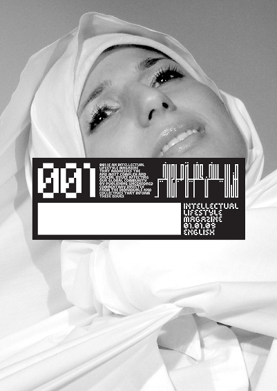
DA | The publication "Intellectual Lifestyle Magazine" was the first thing that struck me due to its similarity conceptually and through colour to Kalimat, can you tell me about it?
Muiz | This was actually my [BA in Design and Art Direction 2008-2009] graduation project. [It was] a combination of the reasons why I could see the creative arts as a lifelong profession – the idea of using my skills through the visual medium to say a story, to say something about our society, our community, and challenge what was being said about it and about me as well, the whole post 9-11 area and that whole mainstream media redefinition of our terminology such as jihad and veil. Orientalist, you know, revival with this essentially political redefinition. The most creative medium I could think of that could challenge that was a publication – specifically a magazine because it is something that you can pick up, chop and change into it, whereas a book has a beginning, middle and end. It has a narrative, and it also has a kind of intellectual superiority that a lot of communities are turned off by, where magazines have that feeling that they are more accessible. [It was the most] direct and ideal medium to convey quite complex messages and break them down. Second thing I wanted to have were high levels of detail about a particular subject within the presentation of a magazine, so it would be accompanied by high end, stylish art direction, commissioned illustrations, expressive typography, photography. [Even the stock I imagined] is different – matte. It has a different feel from glossy and interacts with the viewers differently in that sense as well. As heavy and academic as [the publication] was, I wanted it to compete with “lifestyle magazines” like Vogue and Esquire, which deal with politics amongst all the product pushing to attract – and are very much based on - the visual [in order to] grab that audience. If this [Intellectual Lifestyle Magazine] is on newsstands it has to look visually interesting to someone who isn’t interested in politics [in order to] to engage with the content.
DA | So this was never printed?
Muiz: It was designed essentially to find a funder. I never launched anything like that before; I wasn’t sure about the finances, registration, copyright implications and all that. I used real women [in the interviews], so I wasn’t sure about using their story and having it published legally and I needed someone who can help with that. Even though it was an academic project, it was very much [like a finished product]. It had the style laid out, it had a manifesto, the typographic structure, a format if it was [to be] a whole magazine. Even though I didn’t design all of it, I had designed 60 pages at least with the intention of it being bigger with more content.
He then swooshes through pages on a tablet (which Muiz mentions isn’t his) to show me the various samples of covers and spreads.

DA | Can you discuss the name?
Muiz | Officially it was called ILM, which obviously in Arabic is ilim (learning), but it made an abbreviation in English, but I can’t remember what it was. It was a working title. The issue number, 001, was the most identifiable aspect of the magazine. The Masthead and all of the content itself from the cover was supposed to look like a label [centred on the front cover], which goes back to my thing about not revealing too much about myself. The point of these magazines, whatever the issue, was that they would have uncensored commentary from different voices, all related to the single issue. In relation to the headscarf [themed issue], we would interview people who were very much against [the headscarf], people who had worn it and taken it off, people who had adopted it later, politicians who were totally against it and thought it should be banned, nationalistic movements, members of the community who were against it, community leaders that felt there was a stigma attached to it, academics who understood that there is was an application of this piece of material that went far beyond an Islamic definition, obviously through the Abrahamic traditions and even the different manifestations of it through one particular religious doctrine. So Islamically you have people adopting in different fashion styles depending on the region, in Egypt, Chechnya, Pakistan, Europe, south of Spain – you know what I mean? That was something to consider.
DA | Were they always themed?
Muiz: Yeah that’s it, every issue delves into an issue. The overall encapsulation of this issue was hijab, well a.k.a. the veil. Here’s an example of a spread of someone who used to wear it and took it off, having the typography act as a veil of someone who is already uncovered. Keeping the layout quite clean so there's not so many pull quotes or navigational elements, everything is simple and clean. It gives a focus on the text and the images that accompany it.
DA | What about the colour palette?
Muiz |In a branding sense it was black and white, the only thing that brings the issues together. It’s not necessarily always a black and white image or a photograph but the first I proposed are photographs. You have the date, the page number in red and the theme of the issue in a barcode Arabic that I made. That's essentially what binds the magazine together. In a way it’s like a research file, so it's not overriding the content and it allows the art direction of the images inside to set the tone. Use of this custom typeface I developed was supposed to be as refreshing to Arabs as to non-Arabs. Article headings are all custom. I didn't have any typographic training at that point so I didn’t know how to make things work so these are all sketched out initially and created in [Adobe] Illustrator!
DA | That’s insane! It’s a lot of work!
Muiz | [laughs] It is a lot of work! It helped me be a little more playful because if I knew what the word was I could chop it and change it and make it fit. It goes back to the duality of the audience I was aiming at, Arabs and non-Arabs. So if I’m aiming this at Arabs, I don’t want to use conventional looking Arabic, I wanted the design to be as dynamic to everyone. It has cursive nuances. There's a lot more but it follows a similar formula. The second issue...
DA | Which are all 001.
Muiz | Well you'll see the 001 in the exhibition has a different typeface, but they are all 001. This one is essentially 002. The second issue I developed after I graduated – I had potential funders interested. Now I showed them how one issue is dealt with, let me show them how this formula will work for the second.
DA | Where did you look for funders?
Muiz | Mostly in the UK. I had done some international work but with no one who had the capacity to fund a project like this. Three years later, I am in a position where I could find someone, but the majority of people I know who have that kind of money also quite rightly have an agenda of their own and want a say in the content. This is the thing as well, I want to start small and allow things to grow and be self-sustaining in that way so it retains a level of independence. If I have to start online, maybe that’s the way things will go. I don't know. I’m not in a hurry to make this happen. I know from academics I’ve spoken to about this that are interested in contributing to it, but in reading other people's views that would be featured in the publication. I know there’s an audience out there.
It’s at this point that Muiz and I are distracted by the coffee that arrives. It’s almost too light. I take it back and ask for it to be darker, but when it comes back, Muiz describes it correctly “That’s really black! Is that black enough?” “It's too black, black enough.” It’s bitter coffee and the sensations are visible in my face. “I can imagine how that’s tasting.” “It’s okay, let’s continue.”
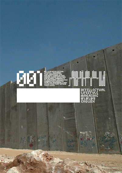
The second issue takes that masthead format and flips it a little bit. The masthead on here – this was supposed to be a political issue, so again it’s Palestine and the reason why I didn’t introduce the black label block on it was to make the design reactive to the content so it emulates the lack of borders, lack of definition and terminology and the abuse of languages, how there's lines but no one sticks to them, all this kind of stuff. That’s why there’s no block. These are three spreads of how the content would be inside, again another custom typeface created for this, [also] reactive to the content. In this case, there’s no space accounted, there's also no horizontal strokes – this is me testing the boundaries of Arabic as we know it. It's still cursive and we know it flows, everything is horizontal, so what happens when we completely flip it and condense it and compact it? What happens to it then? Is it still legible? What is it saying? How does it look aesthetically? It's emulative of the situation – geography that's compacted. Blocks of the wall, compacted geography and population, it emulates military iconography. The photography here was done by a local Pakistani photographer, Qamar Ramzan. He already created these portraits, but unfortunately by that point I hadn't had the chance to interview people that were in Palestine. The photographs that are here are not of subjects that were interviewed. The discussions and case studies are real issues and in a way it comes down that you need to have I don’t know what you officially call it, image rights...
DA | Consent forms.
Muiz |Yes exactly. The palette of this, even though the aspect of colour is very earthy, there’s very little noisy backgrounds. [I wanted it] to look clinical and academic to fit the content.
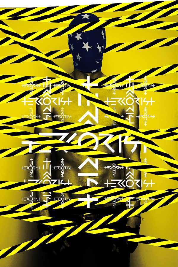
DA | The exhibit at Leighton House [part of the Nour Festival of the Arts] featured a collaboration between you and photographer Andy Houghton. Can you talk about this project?
Muiz | Editorial photographer Andy Houghton communicated entirely online. We actually never met until the private view. [He had already created these photographs] about two and a half years ago. His work deals with male editorial, high fashion, high concept stuff. It's very dramatic, art photography in a way. I saw his work on Flickr which is where I was first uploading my work, and I found it amazing and quite interesting. I’ve never seen editorial photography of men done like that before. It was really dark as well. I like that because things I respond to outside of graphic design, things that have a sort of sinister, not sinister even, oh man! A deeper undercurrent let’s say, so it looks aesthetically interesting but it has a bit of a substance to it, but not always a positive one. The same way as I was dealing with identity and the undercurrent of terrorism, “what is Islam,” and all that kind of stuff, he was dealing with male editorials in aggressive and violent ways, kind of like Steven Klein and Alexander McQueen. [McQueen] deals with that in a dark, beautiful and detailed way. Andy is that kind of guy for me as a photographer. I took some of the experimentations I had made with Arabic type and I thought, “How can I find a good way to apply and show these off now? What is the most appropriate context to put these out there?” Usually when you see type design it's very clinical: here it is at 20 point, at 10, 7, etc. Again, this is less type and more experiment in a way, so I wanted something equally progressive. I thought photography was a cool match. I wanted to show within the Arab community “look what our language can do and how we can take it forward” and outside the Arab community that Arabic isn’t all about Alaa El Din [Aladdin] and all this kind of stuff, that whole sort of faux Arab, Arabised latin text.
DA | Arabesque.
Muiz | Yes Arabesque exactly! Presenting men in this kind of way had this parallel to me of how we see Arab men anyway, this orientalist image that we see them as either really hairy, terrorists, or half naked, de-robed men.
DA | Have you seen Picture an Arab Man by Tamara Abdul Hadi? Her project deals with that portrayal.
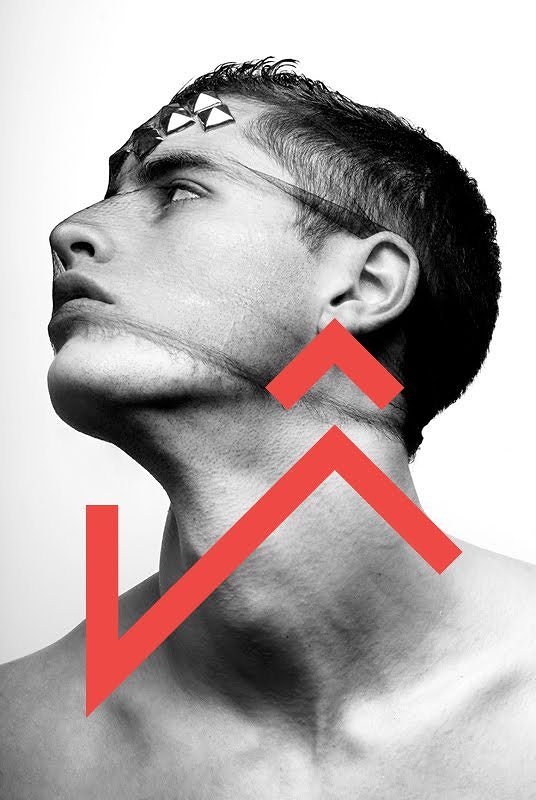
Muiz | Yes I know Tamara! Great project! This one in particular is taking the nuances of handwritten Arabic, the shorthand basically, like the sheen (letter in the Arabic language) we don’t write the three dots perfectly, we do it as a shorthand triangular dash or whatever, taking it out of that wavy structure that we normally have it as and setting it into this angular, aggressive, almost Kufi but not Kufi style graphic typeface. That was a long-winded way of saying it but essentially think of something that is handwritten and making it graphic. Again, the aggression of the sheen and how sharp those angles are works well with the photography, going up on his throat – Arab parallels, even though the guy isn't necessarily Arab and so on.
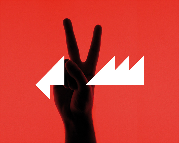
This one is an extension of the morse code Arabic series, it has a unique ligature in it which isn’t in the Morse code series which is this, in the middle it says “Salam.” The reason why it looks this way and why I put the ligature in that manner is because it resembles Playstation-type icons. It's that video game culture of war and peace and the political meandering, the political games that are played passively and remotely. It goes into post-colonialism, a term I don’t agree with, colonialism is no longer physical, it’s remote now, we left but we control from far away. So it has all these undertones in there. But once the work is out there, I want someone to interpret it as they see it and not use my background or who I am as a point of reference.
This one is the flip side: that one deals with handwriting and the pen on paper, while this one deals with Arabic shorthand online.
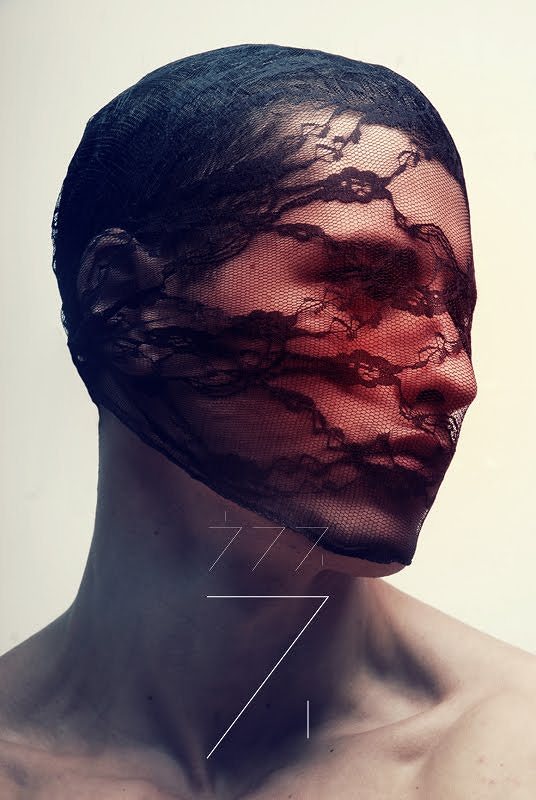
DA | Arabeezee.
Muiz |Exactly, so the Ha becomes a 7 and ain becomes a 3, and so on. English people always look at it and say “how do you read numbers?” And it's like, “we’re not reading numbers!” So I thought how cool would this look as a typeface?
DA | I would love to hear more about the logo for the Palestine Festival of Literature (PalFest). I remember seeing the booklet at An-Najah in 2010 and thinking what a cool logo, finally something innovative which looked like they had actually hired a professional to do it.
Muiz | [The PalFest logo] was all about a deconstructed identity: the different elements represents the idea of a displaced people, piecing together fragments (diaspora), the geometric tatreez (embroidery) which were symbolising weaving narratives in a way which reflects literature. The first year, [they used] a painting in the logo and the second year they used a photograph so I thought best to go with typography for 2010 to emphasise literature and narrative and highlight the bilingual aspect.
DA | How have people responded to it?
Muiz | People have interpreted it as tapestry, neckline of embroidery — I’ve had a very warm response because it does stand out.
muiz.co.uk
Danah
Abdulla is a designer, writer, researcher, and editor. Currently, she
is an MPhil/PhD candidate in the Design department at Goldsmiths,
University of London, and she is also the Founder, Creative Director and
Editor of Kalimat Magazine. She obtained an MA in Social Design from
the Maryland Institute College of Art in Baltimore, Maryland, and a BA
(Honours) in Communications from the University of Ottawa, in Ottawa,
Ontario. dabdulla.com