Local/Not Local: An interview with Maece Seirafi & Pouya Jahanshahi
Published ······ Online, July 2014
Section ······· Art & Design
Across Europe, design and art exhibitions featuring ‘Middle Eastern’ designers and artists are becoming more common, yet it is a rarer occurrence to witness exhibitions of the like in North America. Region specific exhibitions are known to be controversial where many designers and artists refuse to participate in shows labelled 'Middle Eastern' for example, arguing that these shows ghettoise their work, and sidelines them. This is a valid argument, however, although
the art world has become more inclusionary in the past twenty years
(thanks in large part to events such as the 1989 Havana Bienal), the design world continues to be centred around North America and Europe. The mere fact that Arabic, Indian, Thai, and other typography is labelled as 'non-Latin' pushes aside design from so called non-Western contexts. This in turn provides limited
opportunities for designers working in different parts of the world and
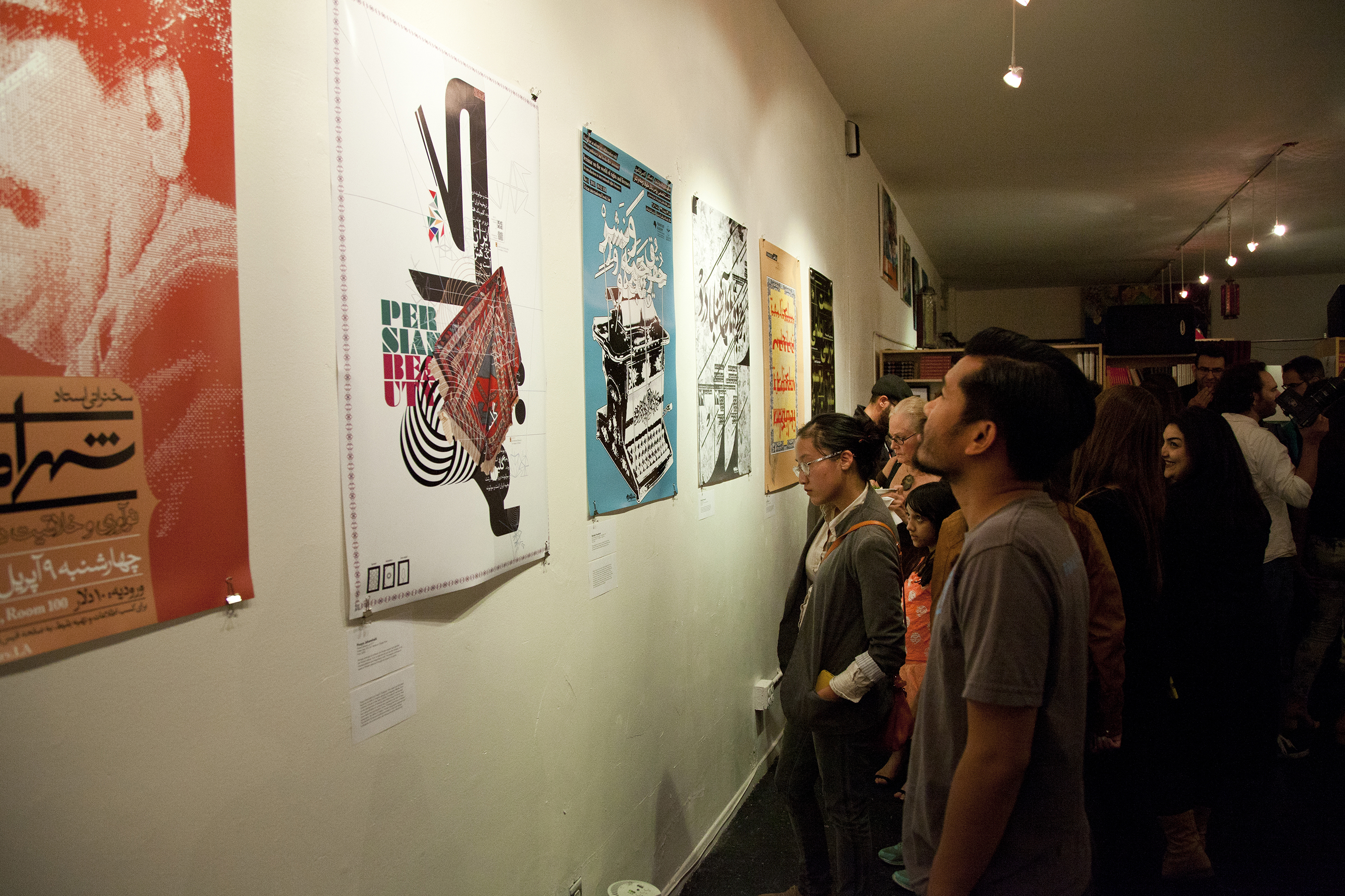
with different scripts to showcase their work internationally...hence the argument for region specific shows to raise their profile. This past month, two region specific shows have opened in the U.S.: the New Museum opened Here and Elsewhere – an exhibition featuring over 45 artists from the Arab world, and Local/Not Local – an exhibition featuring typography from Arab and Iranian designers in California, which opened at the Levantine Cultural Center in Los Angeles in June. Local/Not Local, curated by Los Angeles based designers Maece Seirafi and Pouya Jahanshahi, presents
a collection of works by Arab and Iranian designers who demonstrate the
creative possibilities of working in their native alphabets. I had a
chance to discuss the exhibition with the curators, who shared their vision, its necessity in the U.S., and their future educational aims.
DA | Can you explain the choice of the title Local not Local?
MS | The title Local/Not Local was chosen to describe the design practice of creatives of foreign descent who are living and practicing in the United States. The “Local” aspect brings attention to the works of designers and artists who have made the U.S. their
new home. The “Not Local” dimension is designers and artists paying
homage to their cultural roots through their creative practices. This
specific show focused on Arabic and Iranian works, created in
California.
PJ | There
was a concern of how many languages should be included in the actual
logotype – considering that we were hosting Arabic as well and Iranian
works. Interestingly enough the term “mahalli gheire mahalli”
was a translation that answered to both languages, further demonstrating
how close our historical and linguistics roots in fact are.
DA | How did the idea for the exhibit come to be?
MS | As a Syrian graphic designer educated in California,
I’ve always wanted to explore innovative ways to incorporate my
cultural identity into projects of some shape or form. The turning point
for me was during my MFA thesis where I created a bilingual font system
that was readable in both Arabic and English. I noticed that there was a
need, not just for my sake, but audiences who were interested in
learning more about contemporary Arabic typography. The thought of having an exhibition on Arabic typography was always in the back of my mind but I needed
more reassurance of the concept. I’ve always been fascinated by the
exhibitions and competitions being held in cities like Berlin,
Amsterdam, [and across] the Middle East [which] celebrated the works of Iranian and Arabic designers such as Tarek Atrissi, Reza Abedini, and Pascale
Zoghbi, but that also raised awareness about the technical and
educational tools to help young designers with Arabic type design. It
was actually [the] exhibit Right to Left: Arabic and Iranian Visual Cultures that inspired me to commit to the idea. I thought why couldn’t an
exhibit like this happen in the U.S.? With large communities based in
California it was a notion worth exploring in the form of an exhibit
that celebrated their works and brought forth attention to this ever
growing community. Narrowing the focus to Arab and Iranian typography made in California was an interesting investigation as a co-curator along with Pouya, to analyse
the identity of what it meant to be a Middle Eastern designer based in
California, and how that design practice has been culminated.
PJ | During
my MFA Studies I found myself working with Maece on various levels,
whether it was a simple discussion on the events constantly reshaping
the sociopolitical landscape in the Middle East, or the spectrum of
possibilities laying ahead for us in the realm of graphic design as
multicultural citizens. These converged on our passion for the beauty of form and function present in the Arabic script – the same same script used in Farsi. The fact that we were both designers living in the U.S., yet our passion was rooted in a cultural heritage and a script that belonged to a different land, crystallised the realisation of our occupation of a third space. The development of my MFA thesis
“Hybrid Visual Cultures”, brought my own work to explore this realm
further: where the cross-pollination of cultures have resulted in the
birth of new visual realms and typographic forms. It was during this
phase of my studies that various collaborations with Maece brought forth
the realisation
that there is an absence of this specific perspective in the
contemporary dialogue taking place in the American graphic design arena.
Whether it was the traditional college text book or a simple survey of
design exhibitions taking place in the U.S., there was a clear absence
of the non-Latin voice; the seeds for Local/Not Local were thus planted.
DA | Why is a show like this particularly necessary? And necessary in the United States?
MS | A show like this is necessary specifically in the U.S. because of the various cultural diversities the design landscape has to offer, and yet they are mostly [sidelined].
Arabic and Iranian designers need to be informed about their own
identity in a contemporary way and therefore should question and
contribute to the notion of where the future of Arabic and Iranian
design and typography is heading. This exhibit specifically touches upon
the rich cultural diversity that California’s ever changing design
landscape is being shaped by. Often Arabic and Iranian typography is
characterised by both the Arab and non-Arab
audiences as being only present in calligraphy. This exhibit reveals – through Arabic and Iranian typography – designers in the contemporary
scene who have evolved beyond traditional calligraphy and fine art
practices and towards typographic design, posters, branding identities, as well as participating in commercial and self initiated projects. Lastly, this exhibit also serves as a networking [opportunity] for designers to showcase their works to build and diversify their networks. Furthermore, if this show becomes a travelling exhibit, it can educate audiences in various communities and [hopefully] inspire them to [celebrate] their own cultural diversities in the design landscape.
PJ | From a broader perspective, the U.S. is after all referred to as a “melting pot” of world cultures. [One of the country’s] unique [attributes] is this specific characteristic that has allowed it to prosper: by bringing the best of the best from across the spectrum from arts
to sciences. Yet at times this melting pot becomes more fractured due
to various cultural and sociopolitical circumstances, resulting in the
loss of awareness of the rich cultural texture that we reside within. Therefore, [the responsibility falls on] its citizens – like us – to be vigilant and continuously bring attention to these gems planted all around us, whether its an exhibition, a poetry recital, or a national conference of sorts.
DA | What was the vision behind it?
MS | The vision behind Local/Not Local was to shed light on the Arab and Iranian designers focussed on Arabic and Iranian typography produced
in California. The show attempts to bring attention to this perspective
by showcasing works by designers and artists living in the U.S., paying homage to their cultural roots through their creative practices. By curating more shows like this, [we] hope to bring more attention to the Arab and Iranian design community.
PJ | From a broader perspective, the concept of Local/Not Local was brought about by sensing the need to further value and recognise the multicultural face of the inhabitants that create the contemporary urban landscape that we reside in. While we are inundated through various medias
of occurrences across the globe, we rarely consider that gateways to
such global perspectives may in fact exist in our immediate locale, and
the diaspora that has come to inhabit the rich multicultural landscape
surrounding us. This is why we chose to focus on our immediate locale for Local/Not Local.
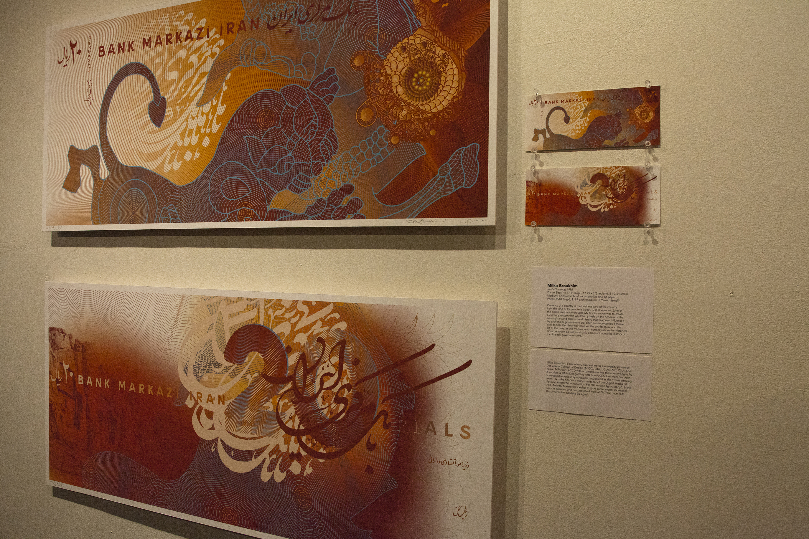
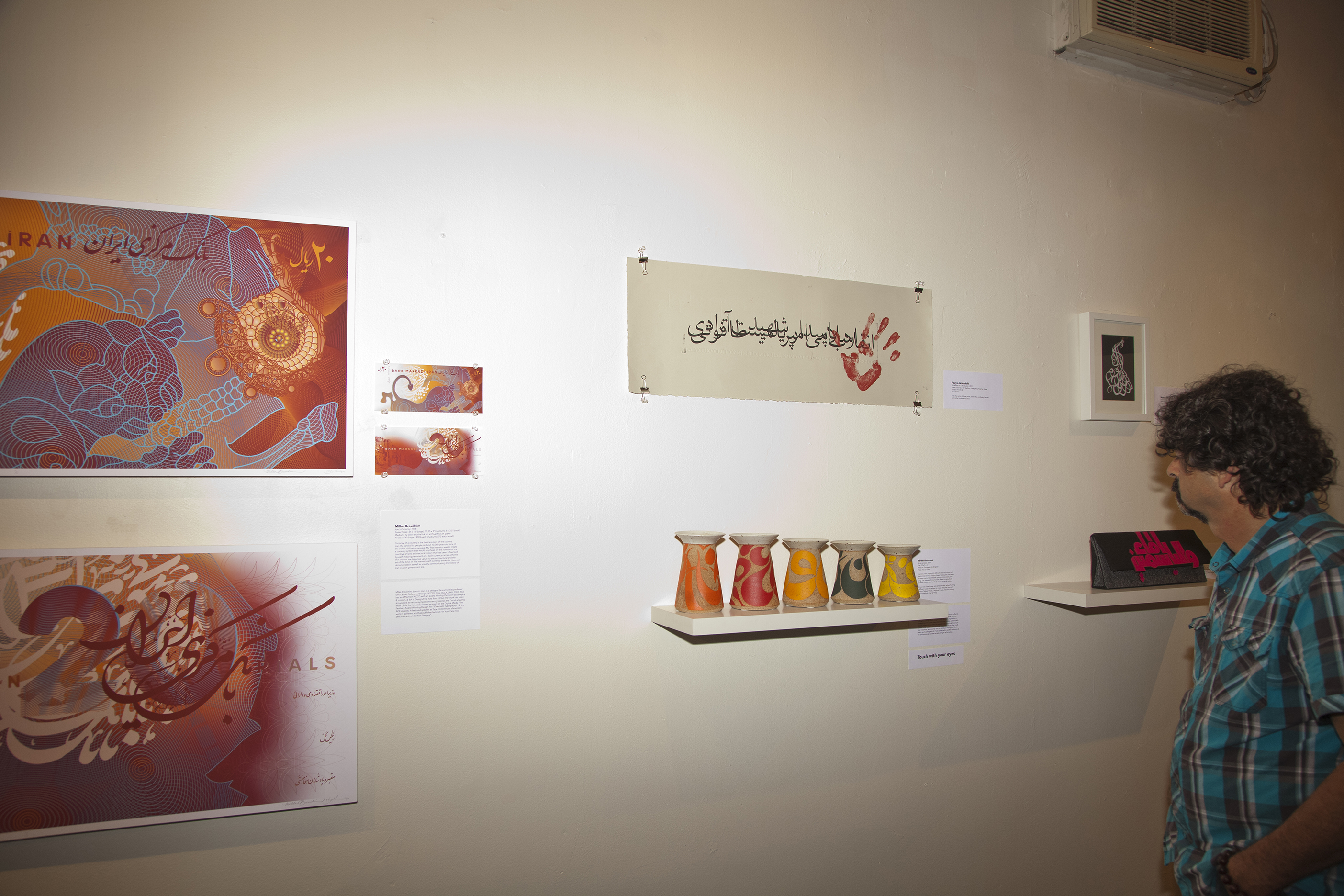
Iran's currency by Milka Broukhim
DA | Why did you choose to focus on typography?
MS | The Arabic alphabet was the [aspect] that unite[d] the chosen designers, [and so] typography was
the most direct manifestation and medium that addressed that notion. We
also wanted to breakaway from recycling trend of displaying traditional
Arabic and Iranian calligraphy, and to show an evolution of the
written word.
PJ | We
purposely expanded the definition of the term “typography” beyond its
traditional academic description to include any form of “type” that was
created in a visual medium, with a purpose of communicating a specific
message at hand. Hence our collection includes dimensional objects and
sculptural forms, in addition to traditional print-based mediums.
Fractured City by Pouya Jahanshahi
DA | What was your criteria as one of the curators for the selection?
MS | [As co-curators], we arrived at a mutual set of criteria between [each other]. [We considered the following factors]:
- Is the work considered to be contemporary and unique to the framework and culture that we live in?
- Does the work carry a clear presence of Arabic and Iranian typography?
- Does the medium define the message?
- How has the Arabic and Iranian typography presented been inspired by the California landscape?
DA | Was the work commissioned or pre-existing or a mixture of both?
MS | The work was mostly pre-existing with a few commissioned works. We initially wanted to showcase client based work, to inform our audiences about the potential client work that exists within the Middle Eastern communities in California, but also client work from abroad done locally.
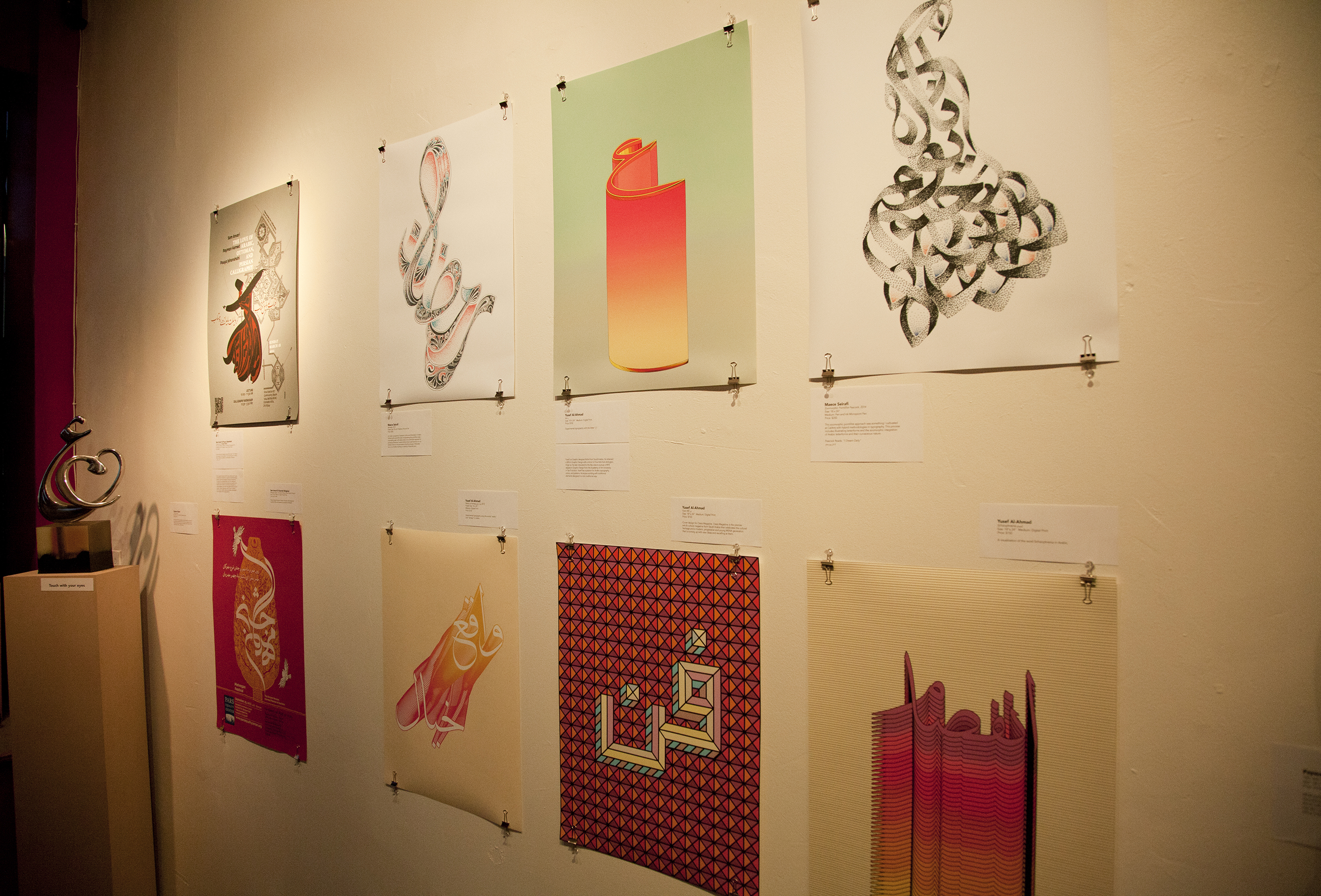
khayalxwaqe3 by Yusef Alahmad
DA | The show opened on the 26 June 2014, how has the reception for it been so far?
MS | The opening of Local/Not Local far exceeded our expectations in regards to the level of curiosity the show has created within various communities. Overall, there was a big turn out and people were very interested in finding out more about the show, the idea [behind it], and if in fact we would consider this as an ongoing initiative. It seemed like the communities we shed light upon were very intrigued that a young generation of Arab and Iranian designers were [introducing] the visual culture of the written word in a modern and contemporary way. Our show will be on until the 28th of August and we’ve been [asked] questions about turning this into a travelling exhibit, when the next show like this will take place, etc. It has been quite a ride so far and it hasn’t slowed down!
PJ | It is as [if] we opened a long awaited portal, giving permission for others to walk through this door with us. Enquiries from various designers and artists on how they can become part of this movement and share their works with audiences are starting to pour in. Furthermore, requests from national and international exhibition spaces have been coming in, requesting us to take this show on the road. It must be mentioned that none of this would have been possible with the sense of camaraderie that existed amongst all our participants, as well as the generosity of our host, executive director Jordan Elgrably of the Levantine Cultural Center.

Mehregan Festival by Sam Anvari and Kourosh Beigpour
DA | Do you have any projects coming up?
MS | On the 28 August, we will be having a closing reception for the show in which Pouya and I will be conducting a lecture called “Fast Forward: Arabic and Iranian Typography”. Other projects we have in mind is designing a book for Local/Not Local since many have expressed interest in the content we have presented. We are also looking forward in the near future to turn Local/Not Local into a travelling exhibit since many venues (galleries, universities, cultural centres) have expressed a shared interest in hosting this event at their respected spaces. Other related personal projects I am about to embark on is a project called “Handmade Arabic Typography”, which explores the various making-methods and cultural context of handmade type, and a bilingual cookbook that experiments with food, typography, and [the] cultural vernacular of the Middle East. Last but not least, I am about to launch my design studio called Lettermake, which focuses on type illustration and hand-lettering.
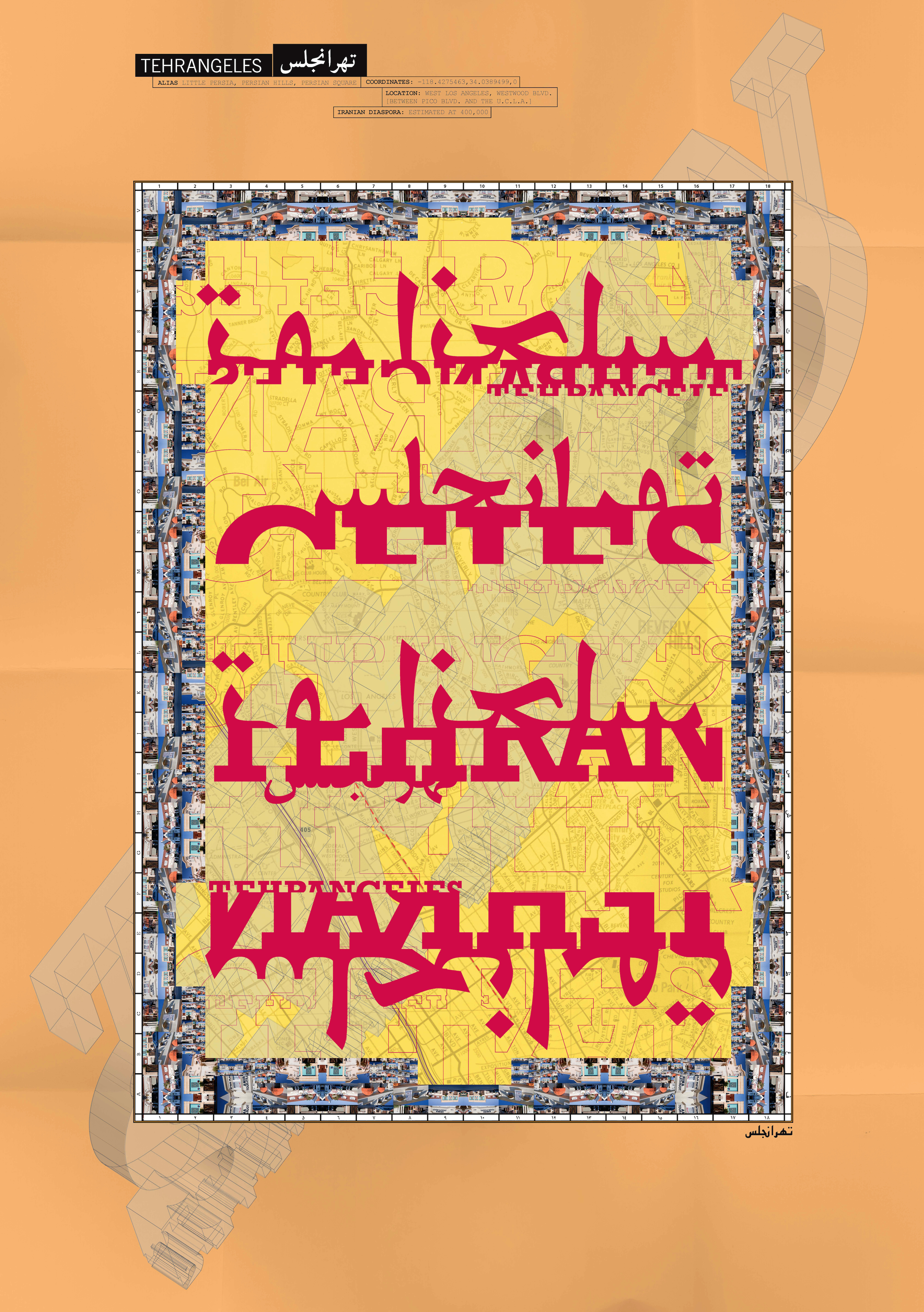
PJ | My vision for Local/Not Local goes beyond this specific exhibition and onto other states around the nation, to expand upon our initial objective of bringing forth beauty and the value of the multicultural landscape the we reside in, throughout America. Other related projects I am working on include an upcoming independent documentary “The Visual Language of Iranian Graphic Design”, and a collaborative locative-media project “Tehrangeles Portal”.
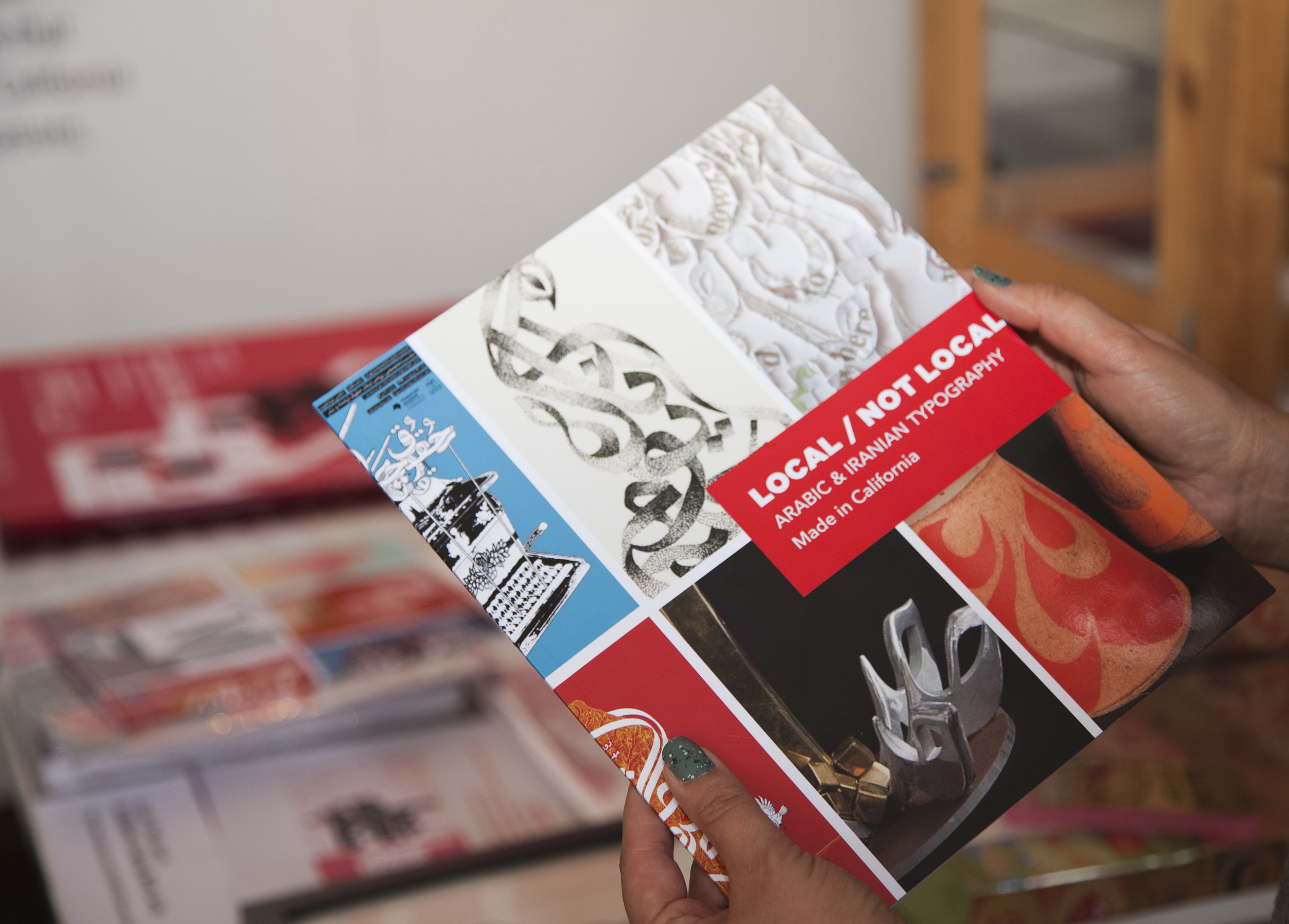
Local/Not Local: Arabic and Iranian Typography Made in California is on at the Levantine Cultural Center in Los Angeles until 29 August 2014
localnotlocal.com | Facebook