A quick Q&A with Mayúscula design studio
Author ········· Danah Abdulla
Published ······ Online, Feb 2016
Section ······· Art & Design
Published ······ Online, Feb 2016
Section ······· Art & Design
All images courtesy of Rocio Martinavarro
![]()
DA | Tell us about your studio – your beginnings, the meaning behind the name, the type of projects you take.
RM | After years working with leading brand consultancies in Barcelona, New York and Amsterdam, I founded Mayúscula [in] 2011. Mayúscula means an uppercase letter in Spanish, [and] our name is an inspiring metaphor that expresses what we believe in and aim for – brands that stand out, strive for excellence, and make a positive impact in their environments. That being said, we are passionate about working with ambitious, perfectionists and challenge-loving clients who want to maximise their potential and innovate continuously. We help them make a difference by using creativity strategically, working on detecting and reinforcing their unique personality traits. The result is [that] they engage with their target audiences better and faster.
We are a small team but work with an international network of both start-ups and multinationals. [Our approach] to branding and design is multidisciplinary: print, digital, verbal, environmental, and product identity. That means we develop integral branding programmes, communicating the brand’s essence coherently through different touch points: a corporate wayfinding system, a packaging line, a digital app or a retail’s interior design.
DA | You’ve worked on a variety of projects outside of Barcelona. Are there big differences between clients in Spain and those based in other countries you’ve worked in?
RM | We specialise in multilingual design projects for brands who want to go further – both metaphorically and literally. Most clients want to go global, but still [want to] integrate the local cultural nuances of their target markets. [So far], we’ve worked in about 12 languages, including Arabic, Japanese, Chinese, Azeri, [and] Russian, sometimes using several of them at the same time. It’s very challenging because some of these clients come from areas [where a] brand[ing] and design culture [is very limited], but those are the companies that need our help the most. They need to invest in branding to be competitive in Western countries where [most] brands are very sophisticated, and also be hyper-competitive to stand out as local leaders in their own markets. There’s a lot to learn for some of them on production and implementation quality.
Cultural differences become interesting anecdotes on a daily basis. For example, we had to consult a Feng Shui master for logo approval when working on a Chinese brand redesign, [and] integrate talismans in retail environments to attract fortune and good luck.

DA | Mayúscula is based in Spain and you work on bilingual branding projects. Can you tell us about some of the challenges you’ve faced dealing with Arabic rather than another Latin language?
RM | Working on bilingual projects is far more complex than working in one language, as you [must work with] double the information but can’t repeat the visual elements to communicate messages. Moreover, not all communication for bilingual clients needs to be bilingual at all times. Most clients [based in the Arab region] want their identities and communication to work in one language as well as [in] bilingual [form], which doubles or triples the work. It is especially difficult when working on brand architecture, as you must add sub-brands and department names, taglines, and also make them work in vertical and horizontal versions.
![]()
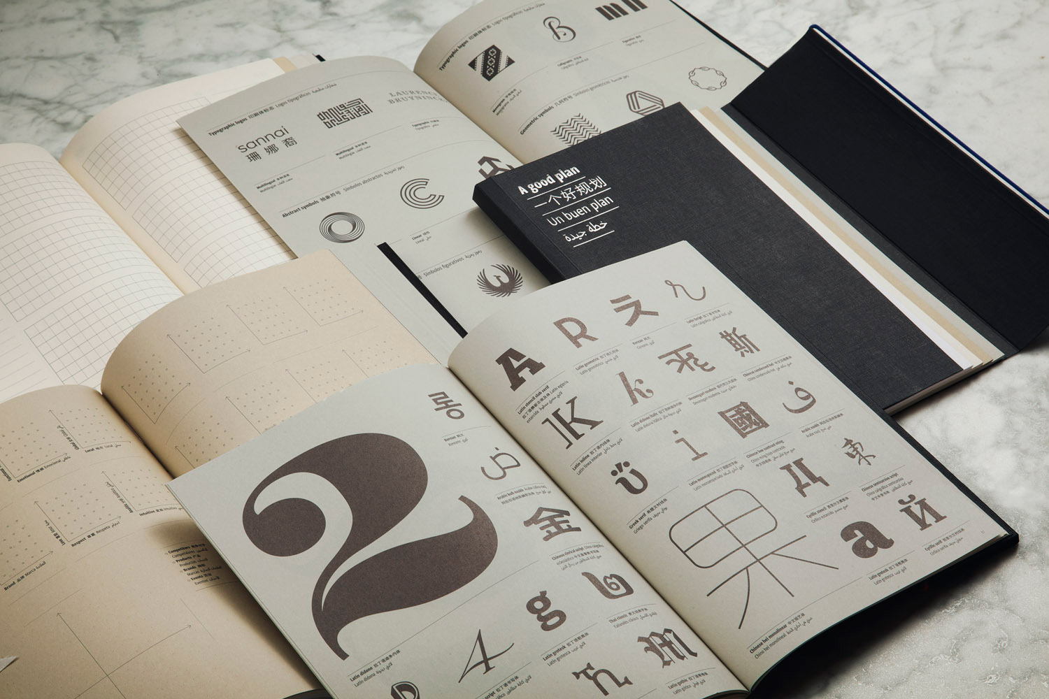
Designing in some non-Latin alphabets is challenging not only because the alphabets are far more extensive, but because the resources available are limited. There’s an immensely rich Arab and Chinese calligraphic heritage, but contemporary digital typography in those languages is still very limited in comparison. Also, when working in the Gulf region, you encounter Farsi and Urdu, [which] contain different ligatures and diacritics. We have a network of freelance professionals we can consult and collaborate with when special or difficult requests arise. Despite the language challenges, the projects we design must maintain graphic quality, convey the messages, be true to the client’s strategy, and be lasting and innovative. Not [an] easy task!
![]()
DA | How did the idea for the planner ‘A Good Plan’ come to you? How do you want people to use it, and why did you decide on the languages you’ve chosen?
RM | Mayúscula needed to develop ways to maintain a healthy long-distance relationship with clients. These methods include tools to know the client better (obtaining better briefs), ways to facilitate his/her understanding of the branding process by talking to [them] in [their] own language, and a means to increase trust by being very transparent during the process. We already worked digitally with ‘A Good Plan’ tools, but wanted to take [it] a step further. [So] we put together a [physical] brand planner.
![]()
![]()
The planner is arranged into four parts:
![]()
[It] cover[s] the [entire] branding process – from business goals to brand launch. In total, [it contains] 128 pages with more than 40 different strategic tools and templates for people to use with their brand example. It’s a map to inspire brands to be different, innovative, intelligent, effective, and efficient. ‘A Good Plan’ has become much more than a notebook/[planner]. It's a platform to [encourage] creatives, entrepreneurs, strategists and business [people] in the creation and management of their brands. The possibilities of ‘A Good Plan’ are many, and we have already used it in workshops, lectures, branding projects and even masterclasses in [some] of the best design schools in Barcelona. It's also a great tool for teachers to use in branding, design and management courses. Regarding [the] languages chosen, Arabic and Chinese are spoken widely in emerging and some rapidly developing economies where creative boutique agencies are hard to find. The need for a more sophisticated branding culture is there, we just wanted to make it easier.
mayuscula.es

DA | Tell us about your studio – your beginnings, the meaning behind the name, the type of projects you take.
RM | After years working with leading brand consultancies in Barcelona, New York and Amsterdam, I founded Mayúscula [in] 2011. Mayúscula means an uppercase letter in Spanish, [and] our name is an inspiring metaphor that expresses what we believe in and aim for – brands that stand out, strive for excellence, and make a positive impact in their environments. That being said, we are passionate about working with ambitious, perfectionists and challenge-loving clients who want to maximise their potential and innovate continuously. We help them make a difference by using creativity strategically, working on detecting and reinforcing their unique personality traits. The result is [that] they engage with their target audiences better and faster.
We are a small team but work with an international network of both start-ups and multinationals. [Our approach] to branding and design is multidisciplinary: print, digital, verbal, environmental, and product identity. That means we develop integral branding programmes, communicating the brand’s essence coherently through different touch points: a corporate wayfinding system, a packaging line, a digital app or a retail’s interior design.
DA | You’ve worked on a variety of projects outside of Barcelona. Are there big differences between clients in Spain and those based in other countries you’ve worked in?
RM | We specialise in multilingual design projects for brands who want to go further – both metaphorically and literally. Most clients want to go global, but still [want to] integrate the local cultural nuances of their target markets. [So far], we’ve worked in about 12 languages, including Arabic, Japanese, Chinese, Azeri, [and] Russian, sometimes using several of them at the same time. It’s very challenging because some of these clients come from areas [where a] brand[ing] and design culture [is very limited], but those are the companies that need our help the most. They need to invest in branding to be competitive in Western countries where [most] brands are very sophisticated, and also be hyper-competitive to stand out as local leaders in their own markets. There’s a lot to learn for some of them on production and implementation quality.
Cultural differences become interesting anecdotes on a daily basis. For example, we had to consult a Feng Shui master for logo approval when working on a Chinese brand redesign, [and] integrate talismans in retail environments to attract fortune and good luck.
DA | Mayúscula is based in Spain and you work on bilingual branding projects. Can you tell us about some of the challenges you’ve faced dealing with Arabic rather than another Latin language?
RM | Working on bilingual projects is far more complex than working in one language, as you [must work with] double the information but can’t repeat the visual elements to communicate messages. Moreover, not all communication for bilingual clients needs to be bilingual at all times. Most clients [based in the Arab region] want their identities and communication to work in one language as well as [in] bilingual [form], which doubles or triples the work. It is especially difficult when working on brand architecture, as you must add sub-brands and department names, taglines, and also make them work in vertical and horizontal versions.

Designing in some non-Latin alphabets is challenging not only because the alphabets are far more extensive, but because the resources available are limited. There’s an immensely rich Arab and Chinese calligraphic heritage, but contemporary digital typography in those languages is still very limited in comparison. Also, when working in the Gulf region, you encounter Farsi and Urdu, [which] contain different ligatures and diacritics. We have a network of freelance professionals we can consult and collaborate with when special or difficult requests arise. Despite the language challenges, the projects we design must maintain graphic quality, convey the messages, be true to the client’s strategy, and be lasting and innovative. Not [an] easy task!

DA | How did the idea for the planner ‘A Good Plan’ come to you? How do you want people to use it, and why did you decide on the languages you’ve chosen?
RM | Mayúscula needed to develop ways to maintain a healthy long-distance relationship with clients. These methods include tools to know the client better (obtaining better briefs), ways to facilitate his/her understanding of the branding process by talking to [them] in [their] own language, and a means to increase trust by being very transparent during the process. We already worked digitally with ‘A Good Plan’ tools, but wanted to take [it] a step further. [So] we put together a [physical] brand planner.
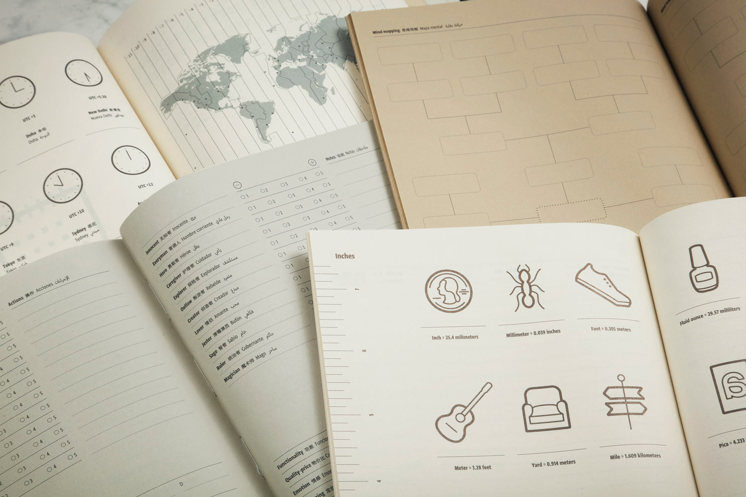
The planner is arranged into four parts:
- Ideas (sketch pages)
- Planning
- Strategy
- Identity

[It] cover[s] the [entire] branding process – from business goals to brand launch. In total, [it contains] 128 pages with more than 40 different strategic tools and templates for people to use with their brand example. It’s a map to inspire brands to be different, innovative, intelligent, effective, and efficient. ‘A Good Plan’ has become much more than a notebook/[planner]. It's a platform to [encourage] creatives, entrepreneurs, strategists and business [people] in the creation and management of their brands. The possibilities of ‘A Good Plan’ are many, and we have already used it in workshops, lectures, branding projects and even masterclasses in [some] of the best design schools in Barcelona. It's also a great tool for teachers to use in branding, design and management courses. Regarding [the] languages chosen, Arabic and Chinese are spoken widely in emerging and some rapidly developing economies where creative boutique agencies are hard to find. The need for a more sophisticated branding culture is there, we just wanted to make it easier.
mayuscula.es
Danah
Abdulla is the Founder, Creative Director and Editor of Kalimat
Magazine. She is a Lecturer on the BA (Hons) Design Management and
Cultures course at the London College of Communication, and a PhD
candidate in the Department of Design at Goldsmiths, University of
London. dabdulla.com